If you're starting an agency, already running an agency and refreshing your website, or just curious about agency world, then you'll know that agency websites are a great showcase of an agency's ability, and important to an agency's overall success. Hence getting an understanding of the best agency websites in the industry can help your business substantially.
Here at SEOptimer we have the pleasure of working closely with thousands of agencies and have taken the opportunity to assemble a list of some of the best agency website's we've come across (from our opinion), broken down into different categories.
For many marketing agencies, their website is somewhat neglected due to client work always taking priority. While this is all too common in the industry, there are some agencies who dedicate time and resource to creating stunning agency websites. Its not just the big end of town, but smaller agencies are punching well above their weight too. This list is a tribute to those agencies who seek to push the creative boundaries and create digital masterpieces online.
Its worth noting we saw countless beautiful agency sites which featured full-frame video, with the agency logo and nav menu overlayed in the header. Whilst these were visually captivating, they relied 100% on the video. In this list, we've only included websites which incorporated more than just video and relied heavily on layout design, graphics including mixed media and/or interactivity. Finally, while these sites are all mobile compatible, they are best experienced on desktop.
We hope these agency websites inspire you if you're building or updating your own site. Enjoy!
Best Small Agency
Typically small agencies have headcounts of 25 or under. These agencies are the lifeblood of the digital industry. Although they might be small, they are mighty! These are our favorite small agency sites.
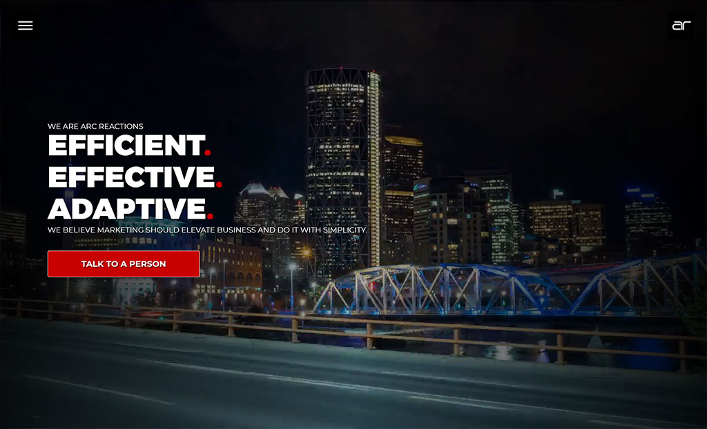
Calgary, Canada
"Arc Reactions believes that great marketing starts with efficiency. Not just in a dollar sense – although that is important too - but efficient in the way it interacts with your audience. Simply put…Arc Reactions believes in the efficiency of information."
Why we love their site: A well-structured site with great use of typography, sizing and color. Arc Reactions blog also holds a wealth of information for digital marketers.
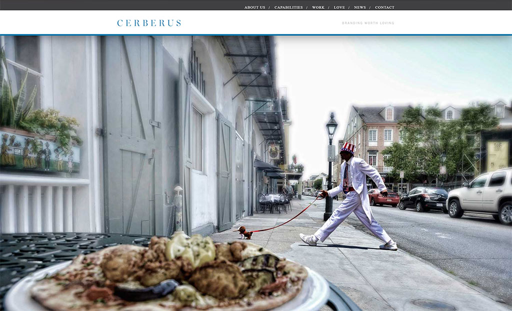
New Orleans, United States
"A mythological creature with three heads and a dragon’s tail, Cerberus was the loyal watchdog stationed by the River Styx. Each head could see the past, present, and future respectively. Like the agency’s namesake, Cerberus’ greatest asset is the ability to focus. Focus enables Cerberus to glean insights from a cluttered landscape, identify effective messaging triggers and marketing tactics, and create simple yet artful designs that drive brands forward."
Why we love their site: Makes great use of client designs featuring the distinctive New Orleans local area. Cerberus' site is simple, clean and puts the work front and center.
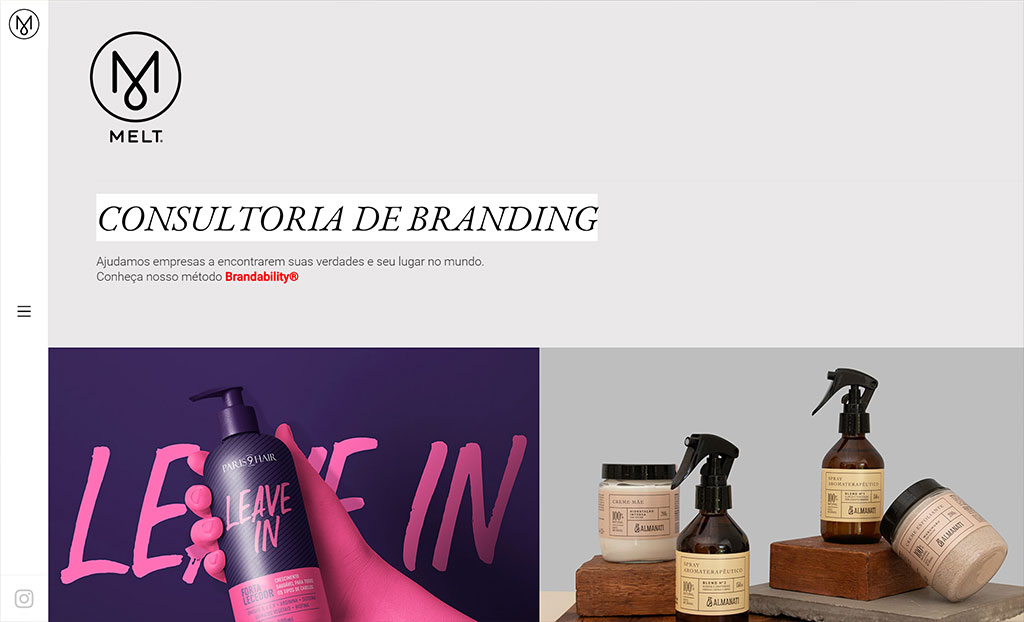
Campinas, Brazil
"MELT is a branding consultancy who helps companies find their truths and their place in the world through strategy, design and their own methodology: Brandability. MELT believes that branding, coupled with design, has a transformative power and brings real results, helping to grow the company and strengthen consistent and relevant brands."
Why we love their site: A left-side menu makes way for a 2-column layout featuring MELT's client work with portfolio tiles opening to 100% width showcasing their work in rich detail.
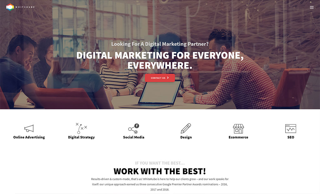
Lisbon, Portugal
"Results-driven & custom-made, WhiteKube is here to help clients grow. Their unique approach earned three consecutive Google Premier Partner Awards nominations – 2016, 2017 and 2018."
Why we love their site: WhiteKube's site communicates lots of information well without it feeling too busy. Case studies are presented nicely and reveal elements as you scroll down the page.
Best Design
These sites encapsulate the essence of beautiful digital design: visually appealing, clean and effortless.
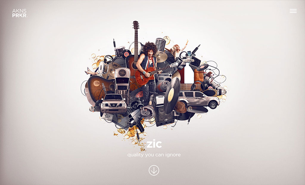
Santa Ana, United States
"AkinsParker was formed in 2004 to combine the strategic planning of an ad agency with the creative tools of a design studio. Their work has offered access to new ideas, introduced unique combinations of technologies, and brought to life solutions as diverse as their clients themselves."
Why we love their site: A unique grid-layout on the homepage works nicely as a dynamic full-frame carousel with featured text, video and beautiful imagery. AkinsParker strikes a perfect blend of form vs function with clean, simple layouts accented by an innovative method for browsing and advancing through content.
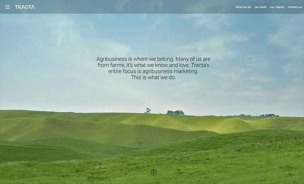
Napier, New Zealand
"TRACTA is an agency dedicated to serving clients in the agribusiness industry. They help their clients communicate smarter brand stories and deliver meaningful consumer experiences using truth and trust to create a direct line of sight from producer to consumer."
Why we love their site: Its hard to compete with the picture-perfect New Zealand countryside. TRACTA's strong brand permeates through the site, used in transitions and page layouts. Set against beautiful scenic backgrounds of life on the land and highlighting place and people.
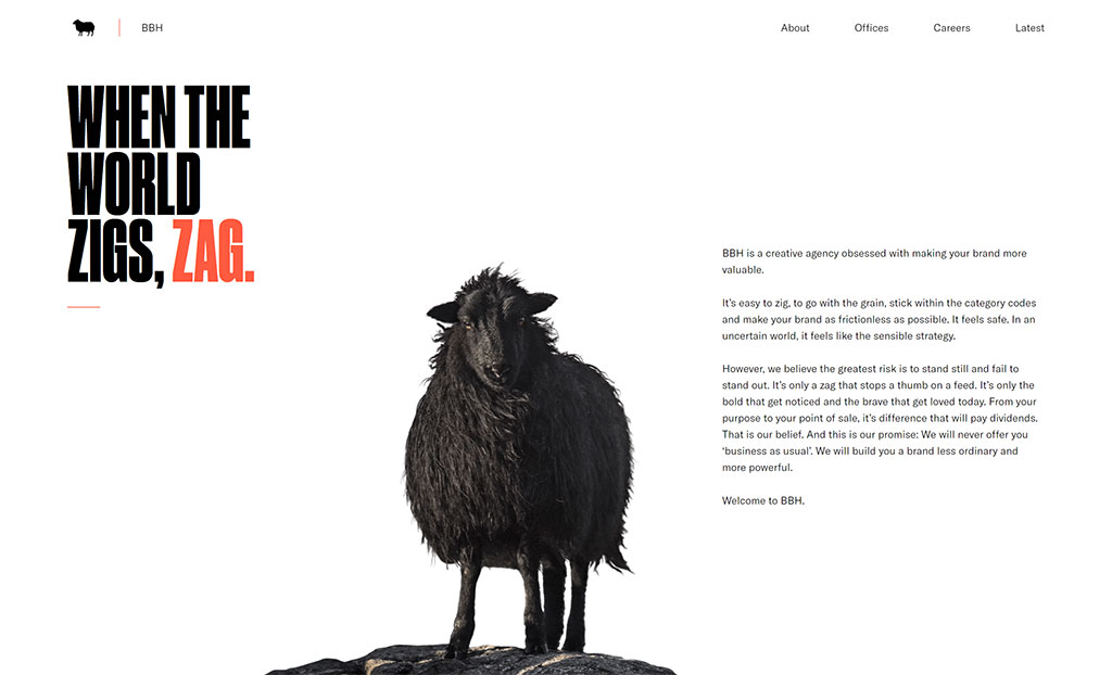
London, United Kingdom
"When the world zigs, zag. BBH is a creative agency obsessed with making brands more valuable. Advertising is just one part of the total brand experience. BBH applies creativity across the customer journey for clients in all four corners of the globe."
Why we love their site: BBH's black sheep is a highly recognizable mascot in the advertising industry and its great to see it take a starring role throughout BBH's website. The homepage features beautiful video case studies prefixed with a surreal black sheep complete with 'wind in its hair' effect sitting side by side with the agency's tagline and manifesto.
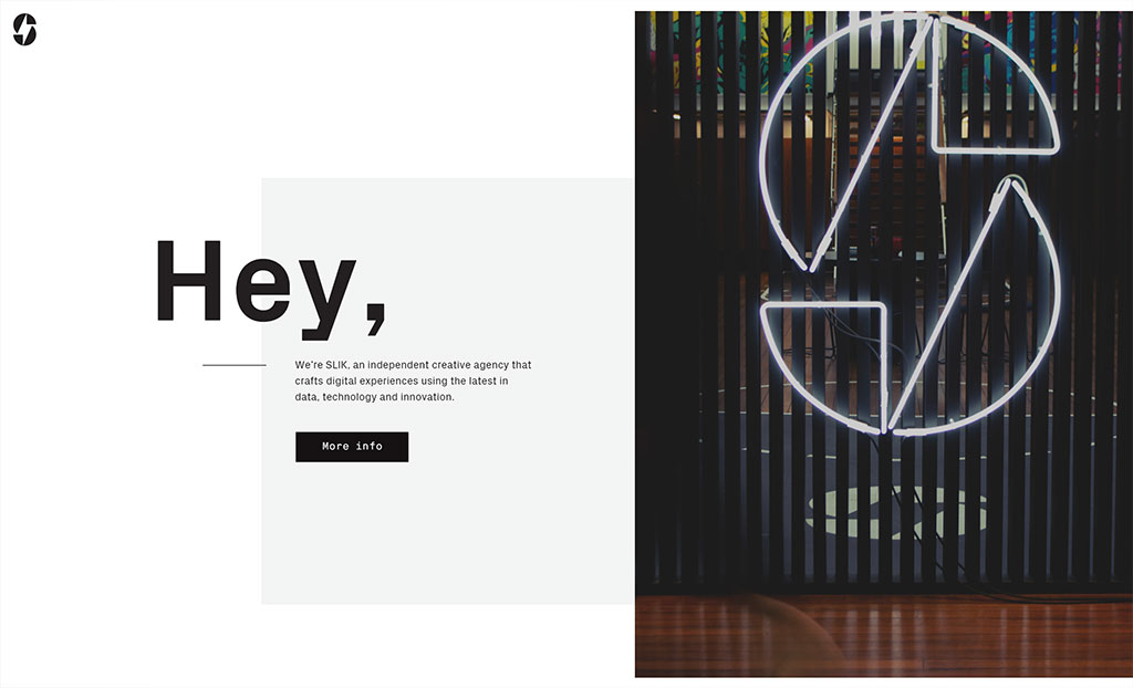
Sydney, Australia
"SLIK is a digitally-driven agency using audience learning, insights and innovation to craft communications that deliver real business results. Everyone at SLIK brings something special to the team with their unique backgrounds and experiences making up the secret sauce that ensures all digital work has a very human heart."
Why we love their site: True to their name, SLIK's website is slick indeed! Featuring a horizontal-scrolling design with great motion effects. SLIK's website is truly memorable and does a fantastic job of visual storytelling as each piece of content 'unfolds' with each scroll.
Best User Experience
Iconfinder CEO Martin LeBlanc said it best when describing UX: "A user interface is like a joke. If you have to explain it, it's not that good". These agency sites craft unique user experiences leveraging the latest technologies and techniques.
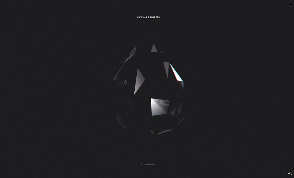
Wellington, New Zealand
"Resn is a creative digital agency infecting minds with gooey interactive experiences and digital stories. Resn helps progressive brands engage with today's connected customers."
Why we love their site: Resn's site is quite the experience! From the main menu you can read more about the agency, explore their stunning client work or visit the contact page. Indeed, all the "expected" content. Or you can click and hold the black crystal on the homepage and be transported to completely random, bizarre and creepy experiences. But when you want out, just let go of the mouse button and you're returned back to the crystal. Careful though, it's addictive!
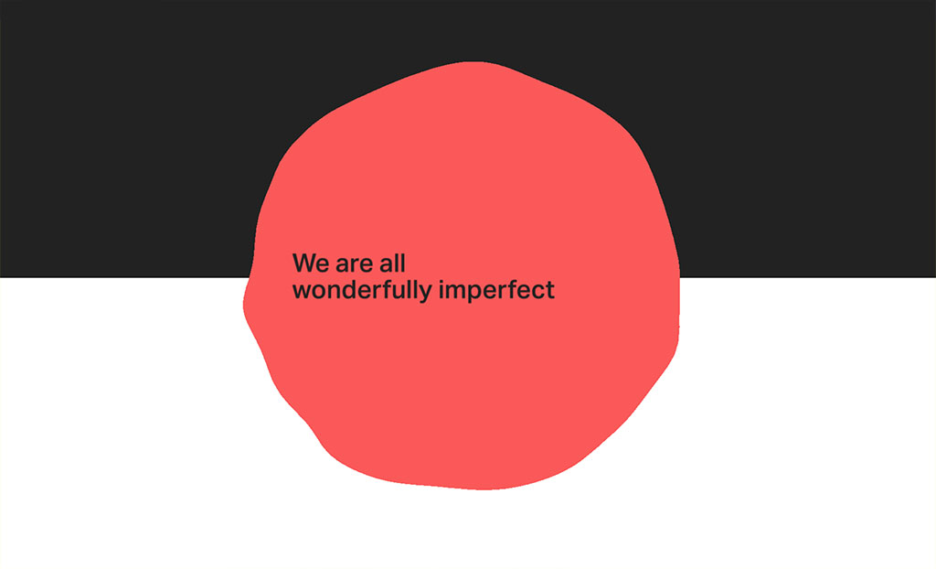
New York, United States
"Firstborn is an award-winning strategic design and technology company part of the Dentsu network. Founded on the belief that smart ideas and beautifully crafted interactive experiences would move their clients' businesses forward. With a cross-disciplinary digital approach to branding, campaign innovation, content and rich interactive experiences, Firstborn continue to push boundaries of digital design."
Why we love their site: Visit Firstborn's site and you'll see they've disabled the vertical scroll bar leaving you with just the scroll wheel on your mouse. As you scroll, you'll see a fascinating effect on the top and bottom of the screen. There are Easter Eggs throughout the site. Subtle interactive pieces, even the video player has unique play/pause controls. While it's visually simple in its execution, it delivers a beautiful fluid experience.
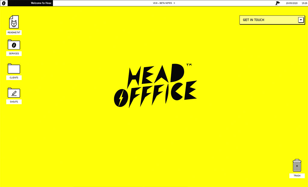
Leeds, United Kingdom
"Head Offfice (with 3 Fs) is an audience-first digital brand and content studio. With a multi-skilled team of designers, developers and writers working in partnership with brands, publishers and audiences - Head Offfice pride themselves on creating digital content that is new and different."
Why we love their site: "Creating digital content that is new and different" - they've certainly achieved this here! The Head Offfice website has been designed as an old-school Mac computer circa 1997. You can click and drag folders and documents around, check out the readme.txt, see what's in the Trash can. You can even 'restart' the website in the top left menu. It's a super unique site and gives us lots of nostalgic feels.
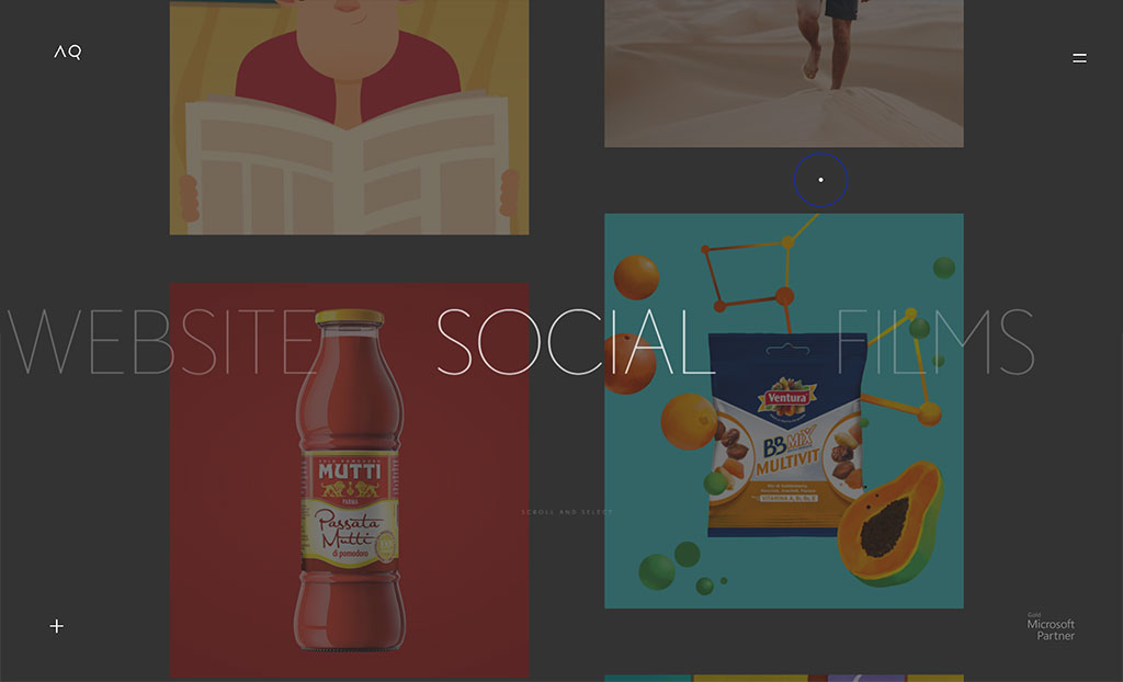
Verona, Italy
"AQuest inspires minds and hearts by transforming the most beautiful dreams into a magical digital experience. AQuest combines creativity and technology to create unique digital experiences that connect brands with people, speaking straight to the heart."
Why we love their site: Another really innovative experience. Interestingly, despite the homepage navigation being non-standard (click and drag), it was surprisingly intuitive and a breeze to navigate around each part of the site. Smooth transitions and motion effects load content over a dynamic video scroller.
Highest Awarded
Like a badge of honor, these agency websites are among the most highly awarded as recognized by industry authorities and peers.
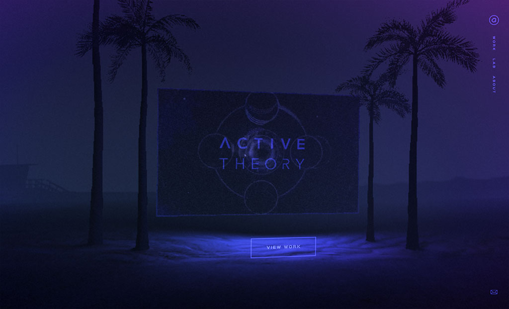
Los Angeles, United States
"A creative digital production studio with office in LA and Amsterdam specializing in building digital experiences that people love. Active Theory has a deep understanding of UX and technical solutions that utilize the latest in web technologies enabling buttery-smooth UI."
Why we love their site: Taking out Awwwards prestigious Site of the Year Award and inducted to The FWA's Hall of Fame, Active Theory's website is an outstanding piece of digital work. The site features a slick, unique interface, immersive environments which tilt based on mouse movement, lots of video, full-screen menus, innovative navigational devices and motion effects throughout. There's something captivating about the site which makes you want to just hang out and stay.
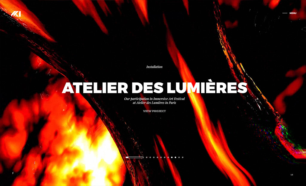
Paris, France
"Based and raised in Paris, HKI is an independent creative company founded in 2004. They deliver cutting-edge digital art experiences for brands, crafted with care."
Why we love their site: Multi-award winning agency HKI have crafted a fascinating connected video sequence on their site showcasing client projects in beautiful 3D layers which come to life as you explore each one. Case studies transition seamlessly in and out as you continue scrolling - genius!
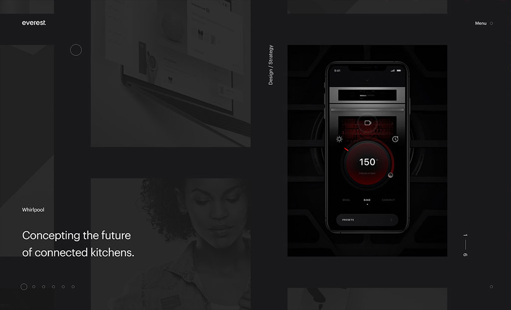
Chicago, United States
"Everest is an interface design and development agency that builds software for smart consumer products. They're obsessed with user experience and have a deep passion for helping their clients solve complex problems. Everest exists to do great work tat creates value for their clients and consumers."
Why we love their site: Winner of Awwwards Site of the Month, Everest's site has a unique vertical scroll carousel with a click and drag interface. The page layouts are super clean with content areas perfectly positioned to flow from one piece to the next. Even Everest's blog articles are visually appealing - its like every pixel has been thought about and finessed when building the site.
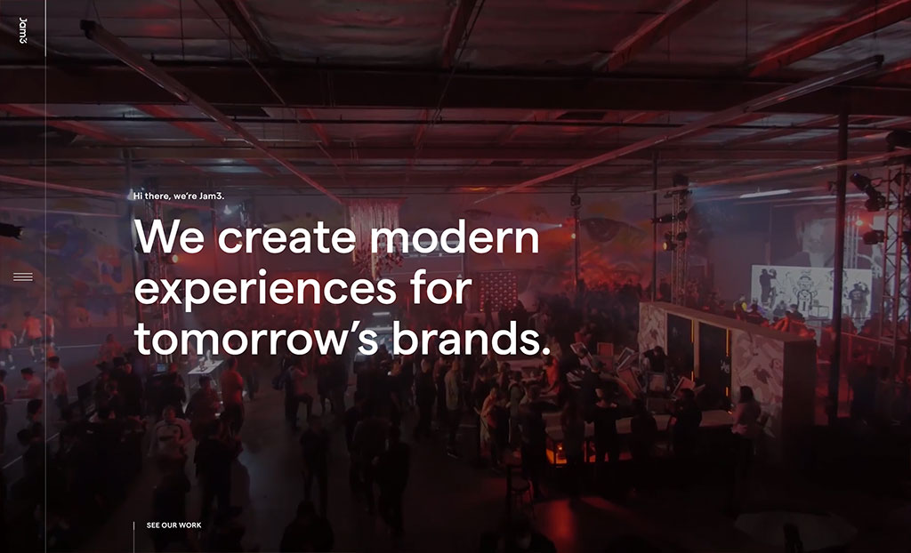
Toronto, Canada
"Since 2008, Jam3 has launched hundreds of projects and won 330+ awards. But numbers don't tell the whole story. Jam3 creates modern experiences for tomorrow's brands."
Why we love their site: Another FWA Hall of Famer, Jam3 have created a polished site with client work front and center shown in stacked panels which transition to dynamic mixed-media case studies.
Best Boundary Pushers
In a world of templates and reusable code, these boundary pushers remind us what's possible on the web.
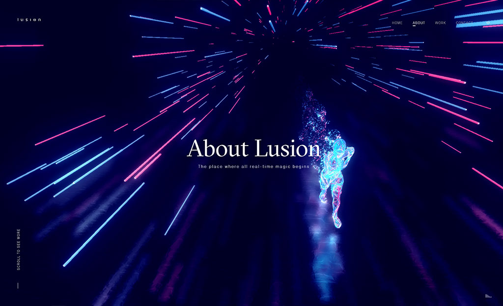
Bristol, United Kingdom
"Lusion is a real-time, development focussed, creative studio. Lusion's vision is to bridge the gap between abstract concept and immersive experience by using the right technology."
Why we love their site: Lusion's site is hands down, the most incredible agency site we've seen. When we talk about pushing boundaries - this is it. Full frame motion graphics, multi-layered interactive elements, audio effects and transitions, 3D animation, parallax effects. This site has it all. The "About" page interactive sequence and interactivity is groundbreaking in its design and execution. Dim the lights, put on the headphones, turn the volume up and explore the world of Lusion!
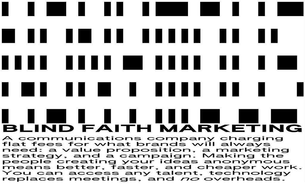
United Kingdom
"Blind Faith Marketing. An anonymous advertising agency for the downturn, creating better, faster and cheaper work. Making the people creating your marketing anonymous, means better, faster and cheaper work. Access any talent, technology replaces meetings and no overheads."
Why we love their site: Apart from being a completely disruptive and novel idea for an agency, NONYMOUS' website is unlike anything we've seen before. A vertical accordion-esque content stacker with Microsoft Paint-inspired mouse cursors executed in a highly innovative and visually disruptive way. It looks and feels 100% true to their brand and purpose.
London, United Kingdom
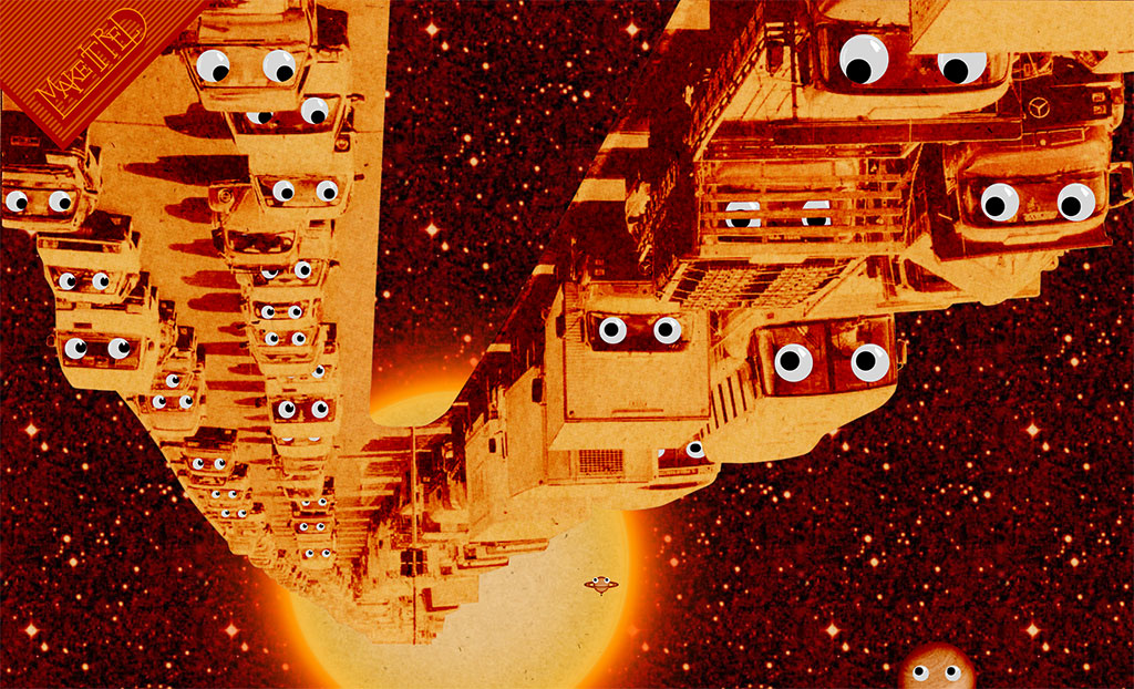
"Make It Red is an international convoy of creativity. Culture is every analogy you can think of – a mish-mash, a treasure trove, a melting pot. Make It Red responds to the world with design sense and clarity. Driven by popular (and sometimes unpopular) cultures, past, present and future."
Why we love their site: Make It Red's site is a surreal experience - one that will probably invade your dreams with hundreds of googly eyes watching you forever. But once you get past that, scroll through the awesome vertical parallax experience. You know you've reached the end when you see the cat sitting next to the cow.
Moscow, Russia
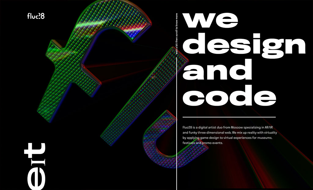
"Fluc28 is a digital artist duo from Moscow specializing in AR/VR and funky three-dimensional web. We mix up reality with virtuality by applying game design to virtual experiences for museums, festivals and promo events."
Why we love their site: Warning, if you're not a fan of neon colors, maybe skip this one. But just as well we are because Fluc28's site is a visual feast serving up trippy shimmering graphics, 3D models and a wacky gradient scrollbar.
Best SEOptimer Score
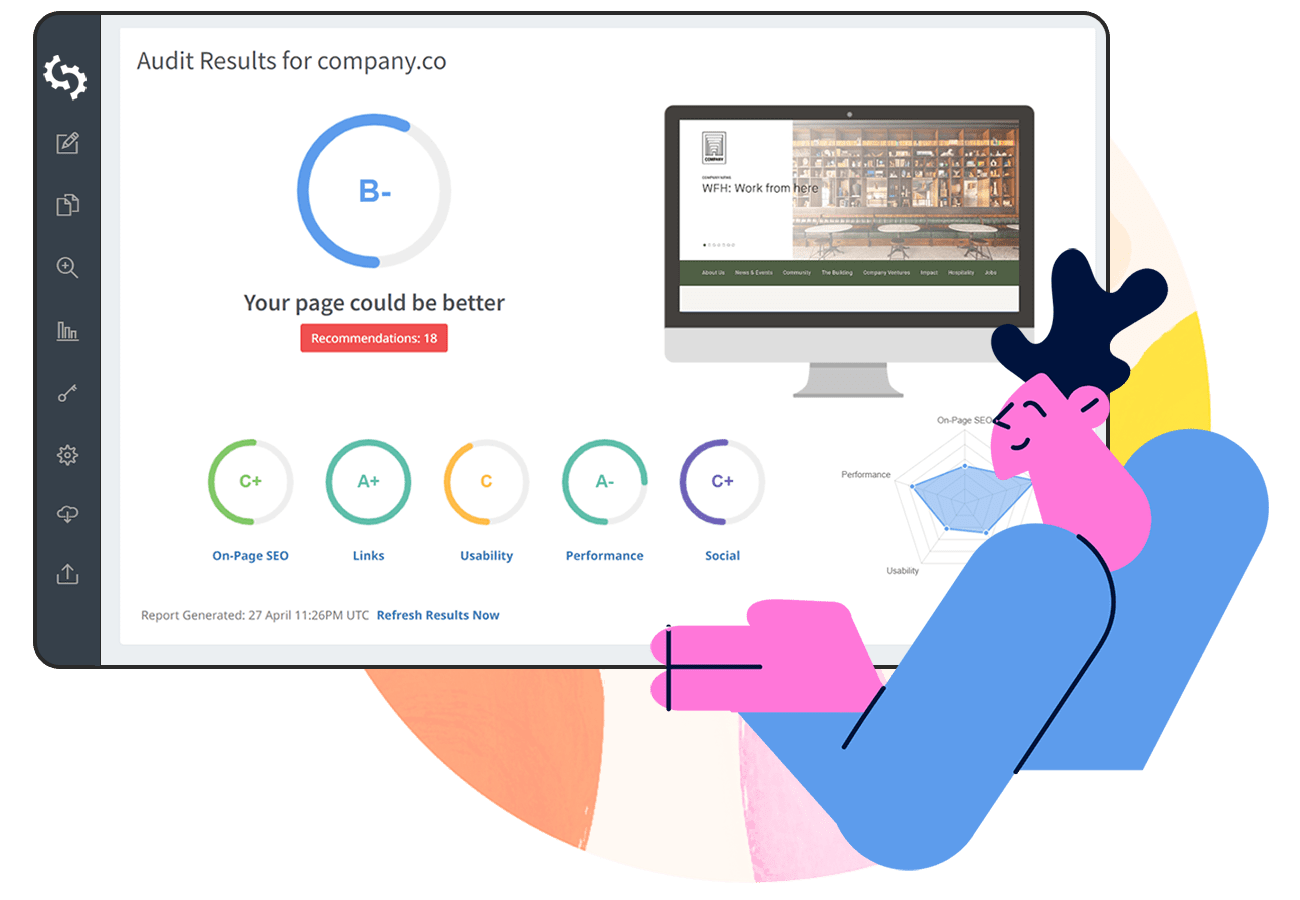
What's the point of a great website if no one can find it? These agencies excel in the SEO stakes, they are A+ as audited by SEOptimer's free audit report. These agencies have mastered on-page SEO and have got their page load speed down to a matter of seconds. Not only do they look great but they tick all the boxes for on-page SEO. You can audit your own or any website instantly with SEOptimer.
Delray Beach, United States
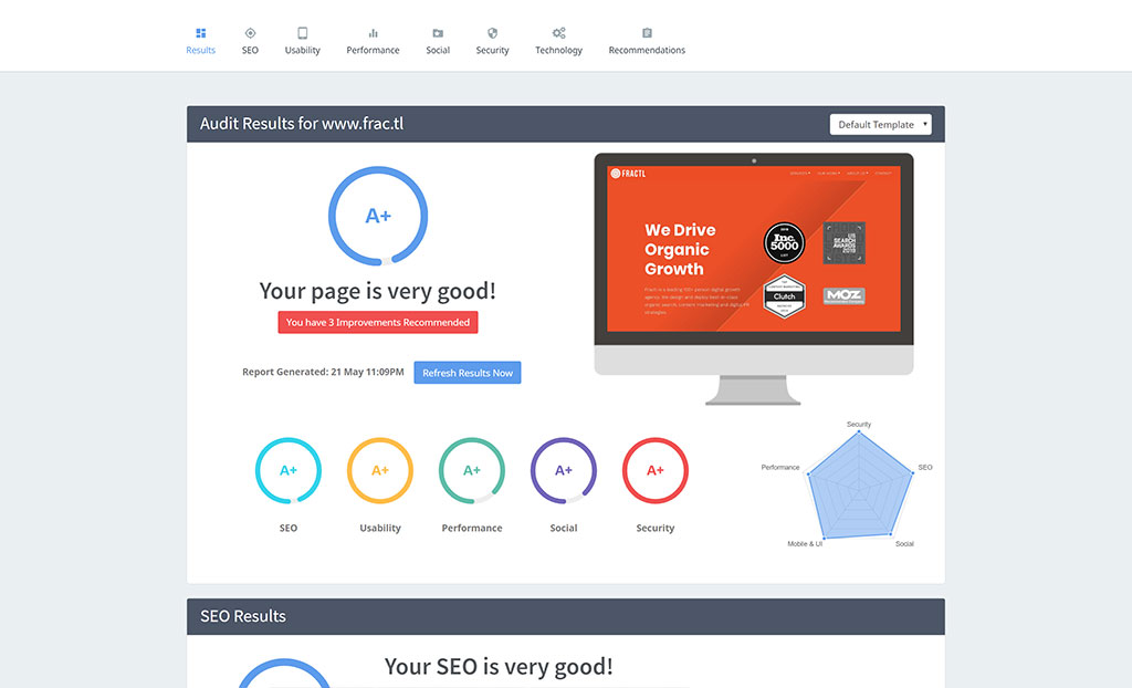
"Fractl is a leading 100+ person digital growth agency who design and deploy best-in-class organic search, content marketing and digital PR strategies."
SEOptimer Audit Score: A+
Server Response time: 0.48 seconds
Page Content Load Speed: 4.0 seconds
Page Scripts Load Speed: 4.5 seconds
Total Page Size: 2.9 MB
Vienna, United States
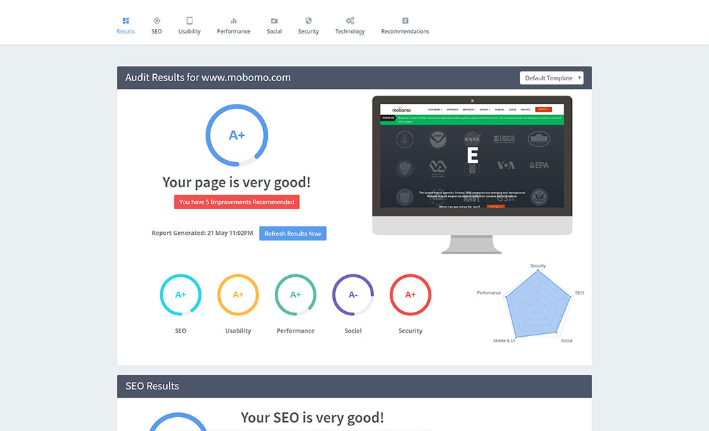
"Mobomo is a full-service DevOps agency focused on creating elegant solutions to solve complex problems. The largest federal agencies, Fortune 1000 companies and emerging tech startups trust Mobomo to build elegant solutions to solve their complex digital problems."
SEOptimer Audit Score: A+
Server Response time: 0.06 seconds
Page Content Load Speed: 3.7 seconds
Page Scripts Load Speed: 9.0 seconds
Total Page Size: 3.7 MB
New York, United States
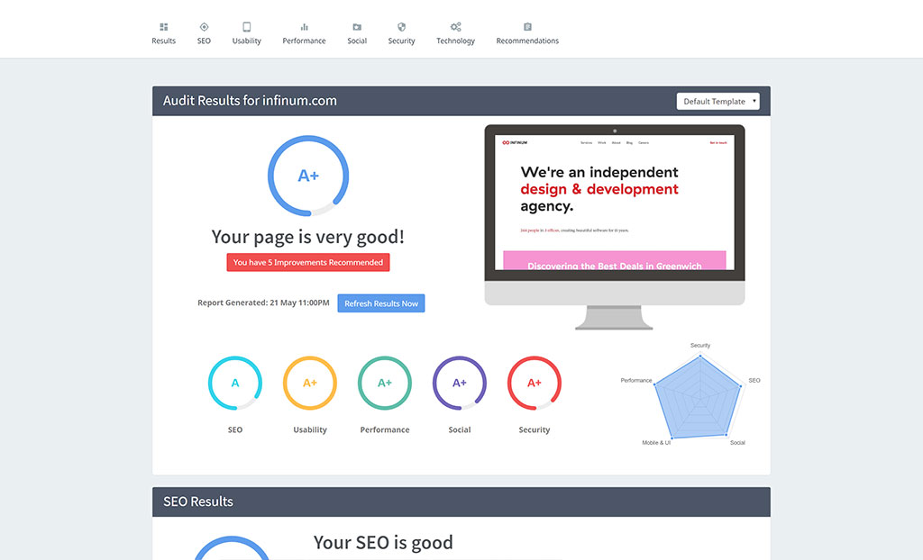
"Infinum is an independent design and development agency specialized in mobile and web development, creating beautiful software for 14 years. Infinum offers clients a full-service approach in all phases of software development - developing a creative concept, planning, graphic design, programming, testing, and publishing."
SEOptimer Audit Score: A+
Server Response time: 0.33 seconds
Page Content Load Speed: 1.9 seconds
Page Scripts Load Speed: 7.0 seconds
Total Page Size: 3.1 MB
New York, United States
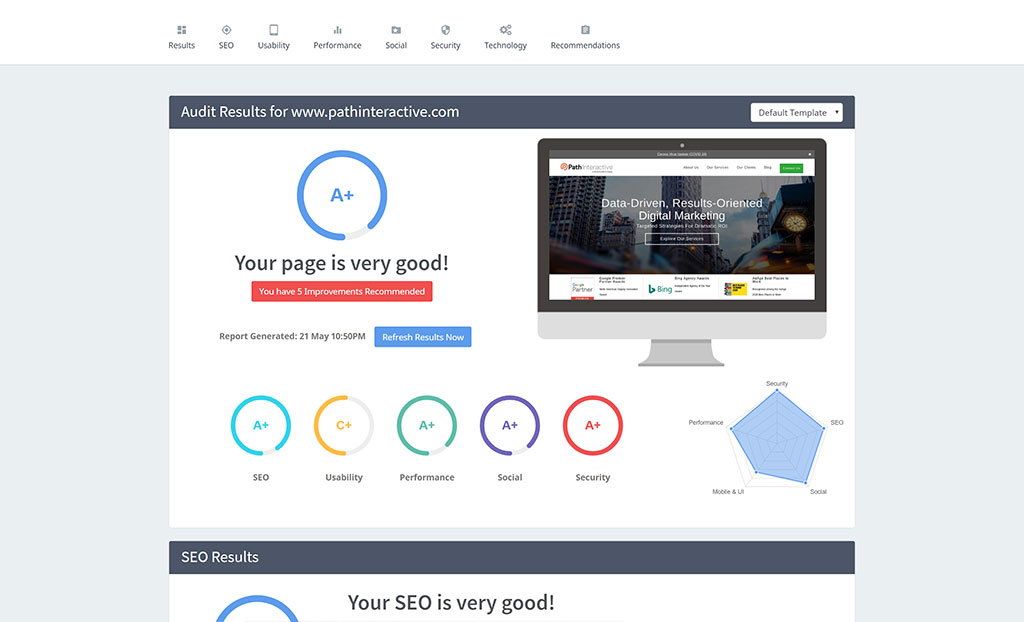
"Path Interactive is a performance-driven digital marketing agency with offices in New York City and Nashville. Path Interactive provides deep expertise in a full suite of results-oriented marketing services including PPC management, SEO, social media and display/digital media advertising."
SEOptimer Audit Score: A+
Server Response time: 0.08 seconds
Page Content Load Speed: 3.3 seconds
Page Scripts Load Speed: 8.5 seconds
Total Page Size: 3.4 MB
That's it!
We hope you enjoyed the inspiration these best-in-class agency websites provide. Let us know in the comments which one is your favorite!
If you're building or redesigning your site make sure you run it through our free SEO Audit Tool to assess your on-page SEO, load speed, usability, social and over 50 individual SEO checks.
