Studying great landing page examples is one of the best ways to learn effective strategy. We’ve rounded up some of our favorites and will break down what’s effective for you.
What are Landing Pages for?
Landing pages are the destination page for a marketing campaign, such as:
- Social media ads
- Email campaigns
- Paid search ads
The best landing pages are self-contained and contain a single, clear call-to-action, like:
- Subscribe
- Call now
- Buy now
- Reserve a spot
- Schedule a free quote
- Join us
Think of them as the digital equivalent of a postcard mailer - all the information you need to take action is on one page.
Landing Page vs Website
A landing page is not the same as a website.
Websites are made of multiple interconnected pages. They contain many links, different sections of information, and invite the visitor to poke around the site to learn more.
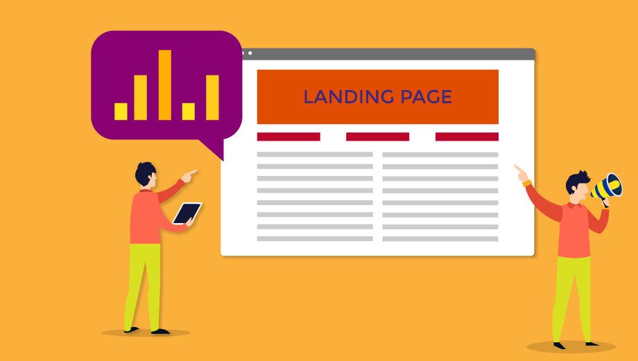
Image source: WebTheoria
Landing pages stand alone and have a single purpose - to promote the chosen CTA.
Additionally, landing pages are designed to receive the traffic from ad campaigns and funnel it to the CTA.
A new landing page is typically designed for each new campaign, and old landing pages are archived.
Websites receive traffic from both paid and organic sources. Websites are often updated but rarely redesigned from scratch.
What is a Landing Page for and Why Should Your Business Have One?
Landing page design is all about getting your customers to take some kind of action. It is the final step of your carefully planned ad strategy.
For example, a potential lead may see an ad for your personal finance course on Twitter. Intrigued, she clicks on the ad - where does that click take the lead?
Answer: your landing page.
If you don’t design a landing page, that click will probably just lead her to your homepage. This is fine, but the potential customer isn’t clearly presented with a CTA on your homepage. She may explore your site for a bit, and then leave to return to what she was originally doing.
By contrast, landing pages give the visitor clear instructions - in this case, encouraging the lead to actually sign up for that personal finance course.
Landing pages have, on average, a 10% conversion rate - which is considered quite high in digital marketing.
Landing pages are important because they are the final, most important step of your ad campaign.
What Makes a Landing Page Successful?
The best landing pages are examples of good copywriting, thoughtful design, and customer psychology. They contain just the right blend of elements that persuade the reader to take action.
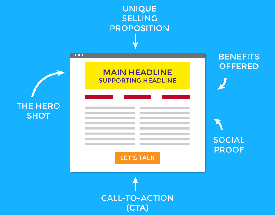
Image source: WebTheoria
Here are the key elements of landing page examples that convert:
Main Headline Supporting Headline
This is your chance to catch your readers’ attention.
Your headline should be clear and appealing. It should also match your ad, so visitors don’t feel misled and quickly bounce off your site. The supporting headline typically adds additional information to the main headline and hints at the CTA to come.
Both your main headline and supporting headline should be short and to the point.
USP
Your unique selling proposition (USP) is whatever makes your product or service stand out. What makes your brand special or different? What do you offer that your competitors don’t?
This isn’t one static statement - ideally, your USP should be communicated through all the elements on your landing page.
For example, you might offer cleaning services at a more convenient time of day than competitors. Or perhaps your discounts on an annual subscription of your service.
Product/Service Benefits
Show all the benefits that your customers will receive. Often presented as a list, this emphasizes the value of everything you are offering.
Images and Videos
Graphics, images, and videos communicate volumes about your brand, product, and value almost instantly. A website landing page often features a “hero” image: one dominant, above-the-fold image that communicates what you are selling (i.e., productive workspace, quality cosmetics, etc.)
Images or graphics should be thoughtfully added to communicate your USP and product benefits. Don’t fill up the page with meaningless stock photos.
Integrating videos is even more effective than just images. According to TechJury, adding short videos that show the real-life benefits of your product can increase conversions up to 86%.
Social Proof
Reviews, testimonials, and endorsements are all types of social proof.
Online shoppers increasingly expect trustworthy reviews from other consumers they relate to before they see a product or brand as reliable. Sharing these on a landing page can increase your conversions compared to pages without them.
CTA
Landing page design is all about getting leads to that all-important step: the call to action.
The most important thing to remember about your landing page CTA is that there should be only one.
Don’t confuse and frustrate your visitors by providing multiple opt-ins and sign-up forms. Keep your CTA clear, compelling, and consistent.
20 Best Landing Pages Examples
A high converting landing page will have the landing page elements we just listed. But the best way to learn good landing page design is to study examples.
We’ve rounded up 20 of the best landing pages to show you how the elements all work together to promote a clear, concise, and consistent CTA.
#1 - HotJar
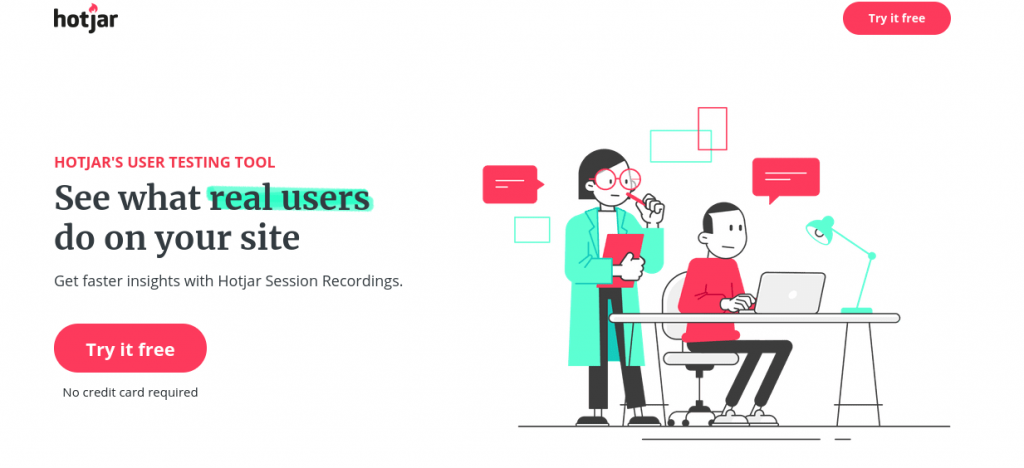
This landing page has an attention-getting headline that immediately shows the benefits to customers. It communicates the USP effectively - HotJar shows you what real people are doing on your site, not just models.
This design is particularly effective because no scrolling is required. The USP, benefits, and CTA are all listed clearly above the fold and paired with bright, energetic graphics that suggest the target audience - marketers.
#2 - Mint by Intuit
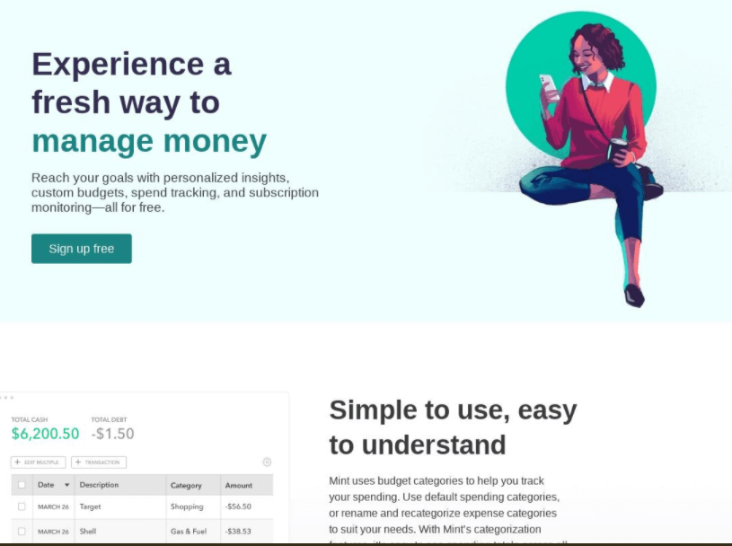
The design elements on this landing page all point strongly to the CTA - a “sign up free” button. While visitors can scroll down the page to read more and see examples of Mint’s budgeting tool, everything they need to take action is above the fold.
#3 - MailChimp
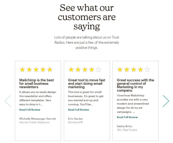
While MailChimp’s landing page is a bit longer than we would recommend, it’s an excellent landing page example of social proof.
Including customer testimonials is a good way to boost the authority of your landing page and encourage leads to try out your product or service. MailChimp even uses the familiar star ranking images - not because it needs to, but because it’s reassuring to online shoppers.
#4 - Inbox Insight

Inbox Insight offers a great example of matching the targeted ad to the landing page. This ad promotes a free lead magnet - their “holy grail of B2B marketing segmentation.”
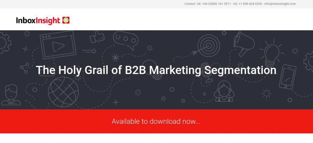
The landing page matches the overall design of the ad and brings the lead directly to what they want - the downloadable document. This is good because it keeps leads on the page, since they immediately found what they clicked through for.
#5- The Piano Guys
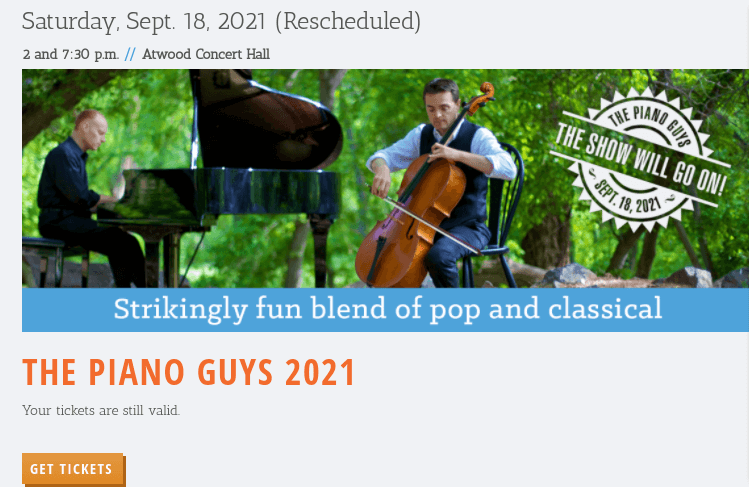
Events are perfect opportunities for landing pages that convert. The CTA is simple - buy tickets here.
This landing page shows all the relevant information - date, location, time - above the fold for the event. The clear graphic of the group reassures customers that they are buying the correct tickets, and a brightly-colored “get tickets” button makes it easy to complete the sale.
#6 - Bose
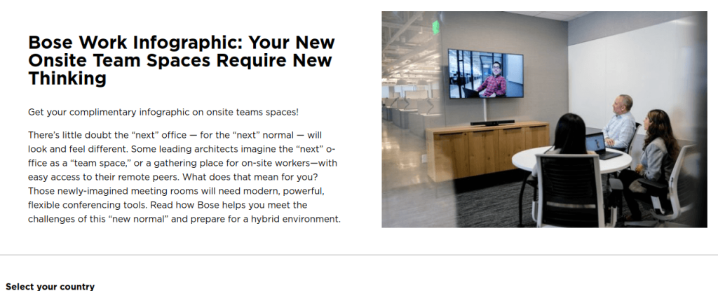
While we don’t recommend the excessive amount of text on this landing page, it’s a good example of a brand pivoting to a new product offering amidst workplace changes.
Landing pages are a good place to offer lead magnets, and Bose uses this page to offer a free infographic that shows what their brand can offer hybrid workspaces. This pairs a free download with a current hot topic - and builds Bose’s email list at the same time.
#7 - Delta
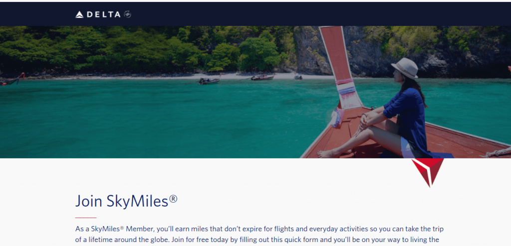
This landing page offers a good example of a hero image. The travel industry is heavily reliant upon aspirational images that encourage customers to picture themselves enjoying an ideal trip.
Delta uses an appealing but tranquil image on this landing page paired with a strong headline that emphasizes the CTA - “join skymiles.”
#8 - Orange Theory
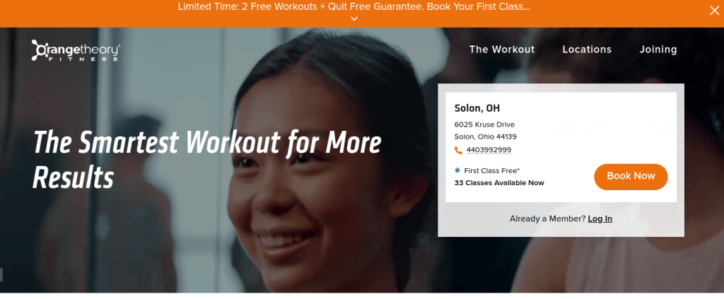
Products and services that are geographically specific can benefit from including an address and contact info on their landing pages. This shows customers that they are registering for the correct location and encourages them to complete the sale on the page.
This landing page from the gym Orange Theory encourages customers to “book now” with the promise of 2 free classes for a “limited time only”- the expiring offer strategy is also used here to, along with a strong hero image.
#9 - Ted Talks
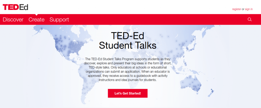
Sometimes landing pages need to include more specific information. In that case, the trick is to include everything important without making it too long to read quickly.
This landing page design uses a neutral background design paired with a strong headline and clear CTA button to keep the text from overwhelming the page. Visitors who are just scanning the information can still see that this is primarily an event for educational institutions
#10 - Shopify
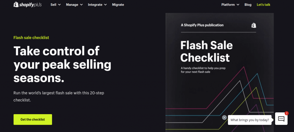
This landing page clearly matches its CTA with its benefits. The headline hooks in its target audience with something all of them want: to “take control” of the selling process.
Adding a visual of the free checklist as a print publication is a nice touch - it makes the offering seem more polished and authoritative while underscoring the value of the action - this is quality information that the customer is getting for free.
#11 - Grow with Google
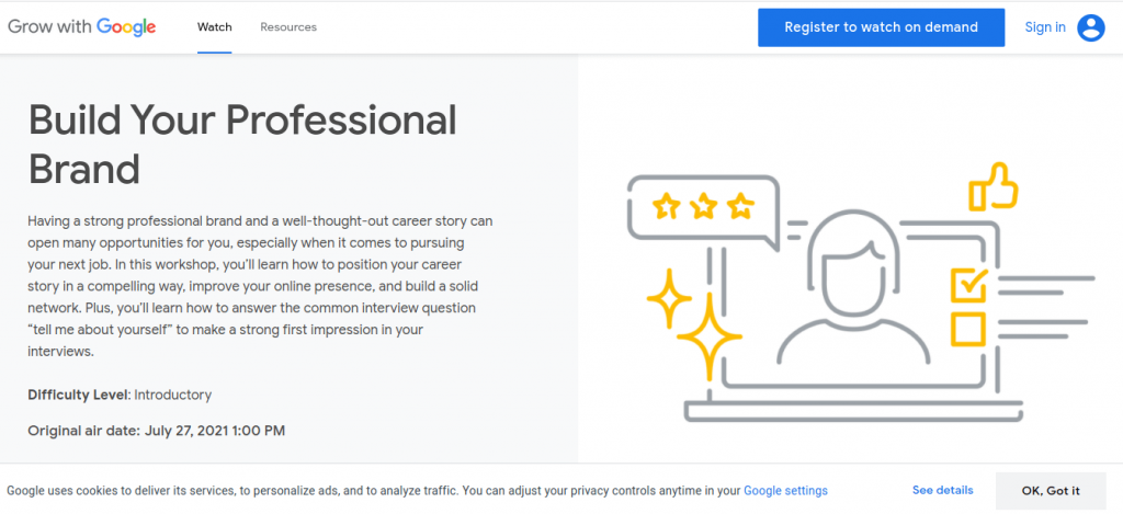
Another example of an event-based landing page, this one promotes a video course offered by Google.
The CTA button is in an unusual spot - the top right of the page - but the bright blue color and most people’s familiarity with Google’s color schemes help it stand out. The headline lets you know immediately what the video is about and additional text provides details about value and benefits without requiring scrolling down.
#12 - Affirm
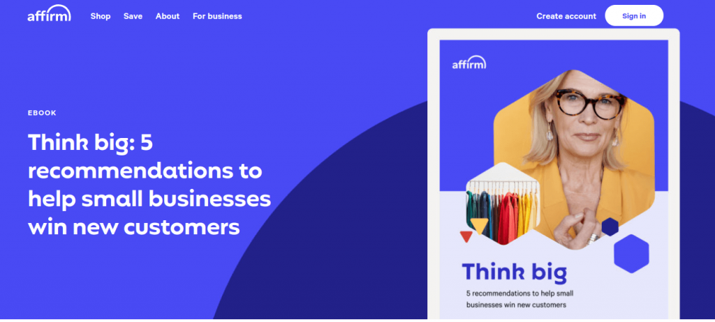
Ebooks are another great lead magnet that pairs well with landing pages. Affirm promotes theirs by using a graphic that looks like an eReader, allowing customers to visualize downloading and reading the eBook right away. The color palette evokes energy, a good idea in fast-paced industries like marketing.
#13 - ShopStyle
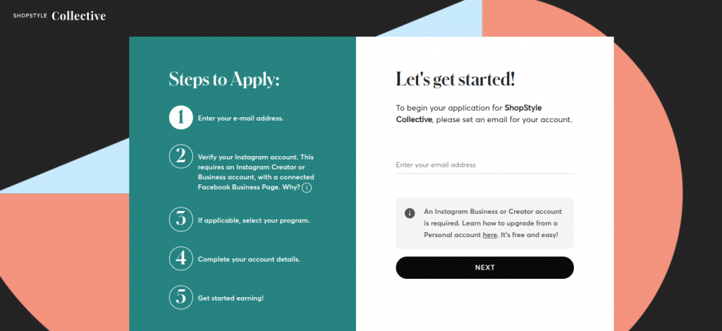
ShopStyle is an affiliate marketing program for Instagram creators. This landing page encourages leads to create an account and apply to the program.
Including the 5-step process on the landing page is a smart move; it encourages leads who might be hesitant to start a lengthy application by telling them what to expect and implying that the process will be quick and easy.
#14 - Editor X
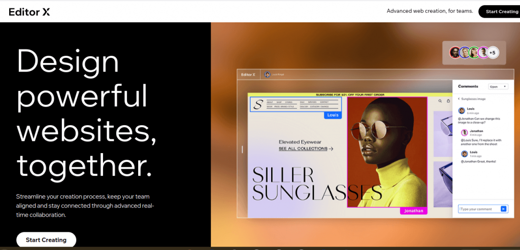
Software can be difficult to advertise, and this landing page uses an image of its design program in action as a strong visual selling point.
We also liked the use of a creative CTA button - “start creating” sounds more appealing and unique than “buy now” or “download free trial.”
The headline does a great job communicating the key benefit of the product rather than simply defining what kind of software it is. By telling customers what they can do with it, Editor X effectively communicates its USP.
#15 - Arizona State University
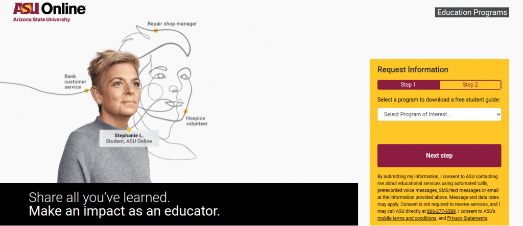
People typically research dozens of different schools online before applying to a program. A good website landing page can encourage potential students to request information, and therefore give the school more chances to persuade the prospective students to apply.
This landing page from Arizona State University does a good job of targeting one specific demographic. The graphic literally connects the dots from the prospective student’s past experiences to a future in teaching - showing how ASU can help her make that shift.
#16 - Slack
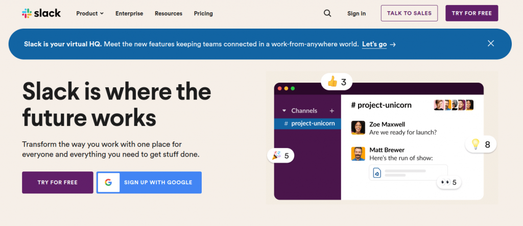
Slack is well-known for having the best landing pages designs. This one effectively shows the platform in action. The strong headline and sub-headline communicate that this is the future of work, and smart workplaces will get on board.
#17 - Bluehost
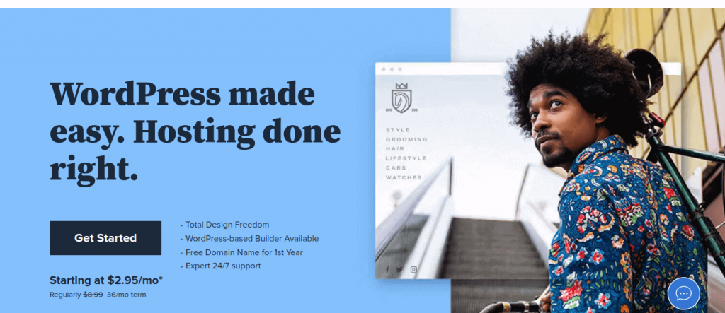
The headline tells you exactly what you are getting - hosting for WordPress sites. Including the pricing on the landing page is part of Bluehost’s USP - it is less expensive than the competition and provides transparent pricing.
#18 - Uber
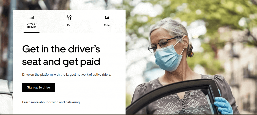
Uber conveys multiple reassurances with its hero image to help recruit new drivers. The model is wearing a mask and gloves, indicating Uber’s concern for safety. She is also older than the general public typically considered Uber drivers, communicating that this is an accessible and inclusive position.
The strong headline is an emotional appeal to prospective drivers - if you want to make money, you just need to get behind the wheel.
#19 - Adobe Creative Cloud
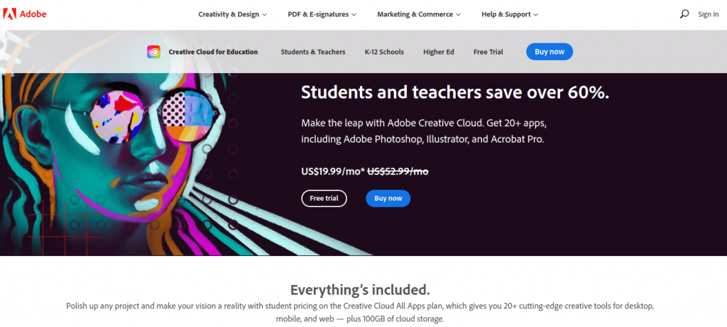
Since Adobe Creative Cloud is so well known, this landing page is less about communicating the benefits of the service and more about showing the USP - the 60% discount for students and teachers.
This shows how landing pages can be used effectively to promote sales or special deals, apart from a brand’s regular marketing.
#20 - Loomly
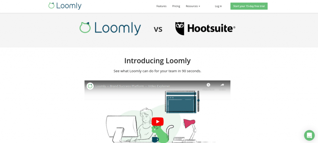
Last but not least, Loomly chose an aggressive strategy on it’s landing page - “Loomly vs Hootsuite.” Potential customers are intrigued, and watch the short video explaining why Loomly is a better version of what they already are familiar with. They then scroll to the CTA button, which is a free trial.
Landing Page Checkup
Does your brand link its ad campaigns to landing pages? If so, compare your existing pages to some of the examples above. Identify which elements stood out to you, and how you can implement similar strategies in your own marketing campaigns.
