What is a Read More Button and Why are They Useful?
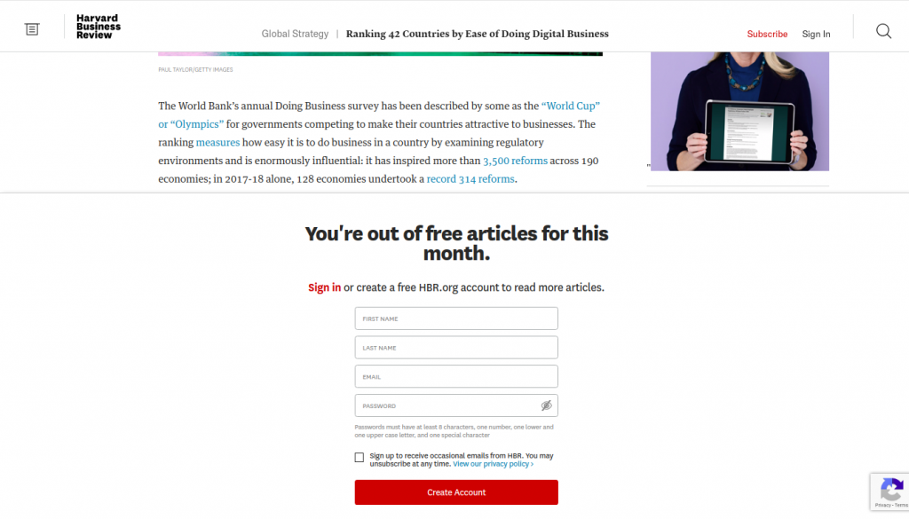
A read more button as a website element that allows you to truncate content so only a part of the content is displayed. It is also used to toggle between showing and hiding content, for example when a site has a paywall on certain content pages.
It can also be used on FAQ pages where only part of the answer is shown and the reader needs to click ‘read more’ in order to see the rest of the answer or in search engine results where only part of the meta description is shown.
When the button is used in this way, it is referred to as an accordion.
An example of hidden content. Source: https://hbr.org/
An example of an accordion:
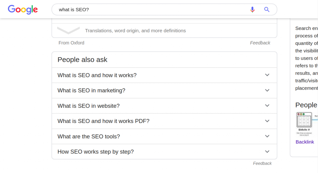
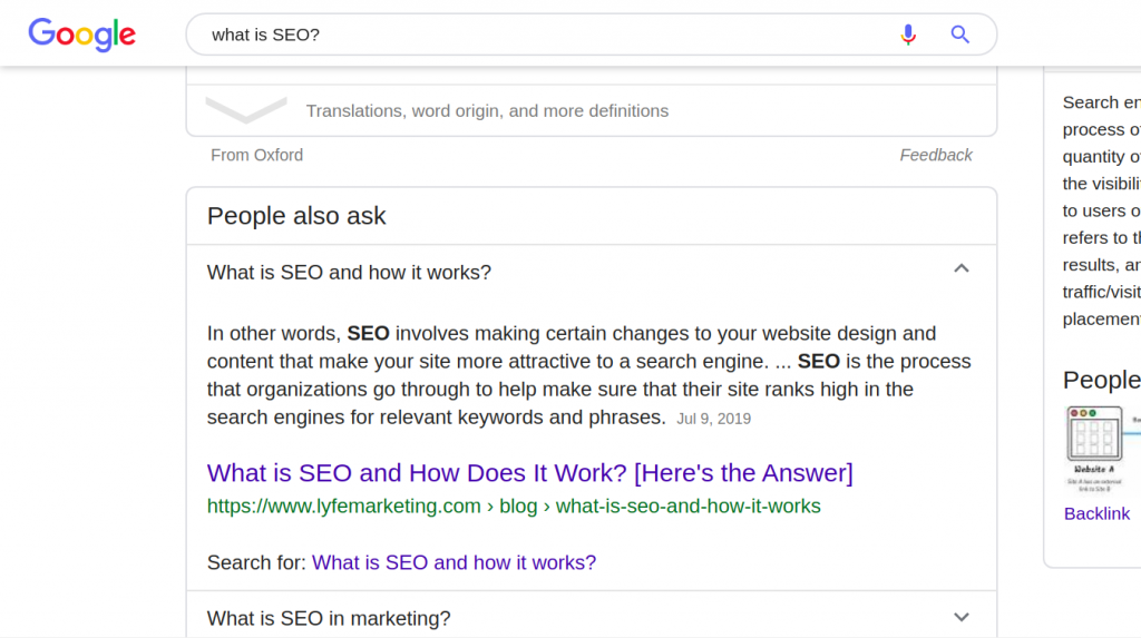
The read more button is also used in emails as shown in the following image:
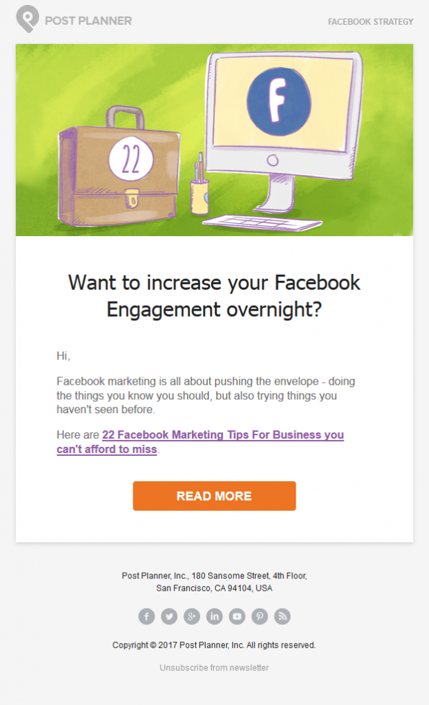
Image source: PostPlanner
The read more button is usually presented as a button, icon, arrow, or hyperlink. Sometimes, it may be a combination of a button/icon and a hyperlink.
This button can also resolve to another page, giving the reader a chance to further interact with the site and its content.
Read More Button Best Practices
Your read more button needs to stand out from the rest of the content. It must be aligned with your brand too. Here are the best practices to follow when creating your read more buttons:
Text Legibility
Make sure that your button’s text is legible and large enough as it will make it more visible. The text size should be reasonably large so users can read the button.
However, don't go overboard as excessively large text will look odd and the user may not even want to click on it.
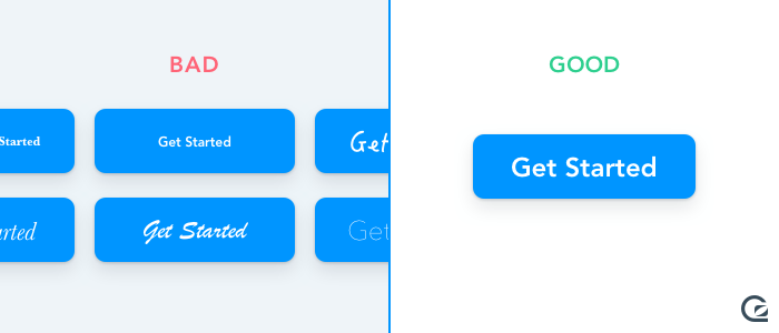
Image source: GoSquared
Use of Contrast
Your read more button needs to stand out, and contrast is one surefire way to achieve this. This website uses the ‘continue reading’ button in place of ‘read more’ to guide its users on the next steps to take.
This button stands out from the rest of the content. It has a purple border that makes it easy for the user to notice. It also has a lot of white space surrounding it.
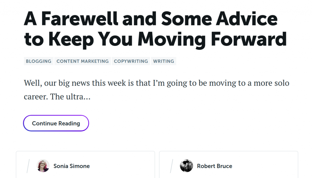
Source: CopyBlogger
Actionable Words
While there is nothing inherently wrong with using ‘read more’, it is advisable to use words that inspire immediate action, as they have a sense of urgency. You can use more urgency and trigger words like 'Read More to Improve Your SEO' etc.
Here are examples of statements that you can use in your ‘read more’ button:
- read now
- read unlimited articles for today only
- Read unlimited articles while offer lasts
- Take advantage of today’s unlimited content offer
Words that point to exclusivity also come in handy. Examples here include ‘exclusive’, ‘subscriber list’, and ‘members’. A call to action example could be, ‘join our exclusive members to read more’.
Adding Benefits
Adding a benefit will also encourage a user to take action. You could, for example, include a benefit like ‘read more and get a free ebook’.
This will inspire your readers to actually click the read more button and read in order to get the benefit, especially if they already enjoy the content that they have already interacted with.
Keep it Short and Sweet
While we mentioned that adding a benefit will inspire your readers to take action, using a few words is ideal. Keep the ‘read more’ button text between 2 and 5 words.
One way to shorten the button text is to use ‘click triggers’. Let’s look at these next.
Use ‘Click Triggers’
This is an additional button text that helps you communicate benefits. Your main button text could be ‘read more’ and your click trigger ‘get my free ebook’.
The main button text needs to be larger and more legible. The click trigger is much smaller.
Mobile-first
When designing your ‘read more’ button, it is important to design first for mobile. Google started using mobile-first indexing, from July 1st, 2019. This means that your ‘read more’ button needs to look great on mobile.
It also needs to be easy to use, keeping in mind that users on screens will be ‘touching’ the screen and not using mice or laptop touchpads. The button needs to be big enough in order for them to ‘touch’ it without having to pinch their screen to make it larger.
A size of at least 48 x 48 dp (density independent pixels) is ideal for mobile devices. The space between buttons should be at least 8 dp. Learn more about mobile UI button design in this article.
Personalize
When the button text is more personalized, users are likely to click. You could, for example, have a ‘read more’ with text like ‘get my free ebook’ instead of the usual ‘read more’.
This not only has a benefit but is more personalized. It could achieve a higher CTR than ‘get your free ebook’.
Stay in the Flow
Your read more button should stay in the user’s natural reading flow. Users read from top to bottom and left to right. Place your ‘read more’ button on the right or bottom of the particular excerpt.
Most importantly, place the button where it is easy to find. Readers need not scroll too far to find it.
How to Add ‘Read More’ Buttons in WordPress
WordPress 5.0 has a new feature that allows you to easily add buttons in WordPress. The new block editor (Gutenberg) comes with an in-built button block which makes it easier to create a ‘read more’ button. Here is how to go about it:
- Log in to your dashboard
- Go to posts
- You can also edit an existing post

- Add a Gutenberg block where you would like to display the ‘read more’ button
- Click the plus icon to add a new element
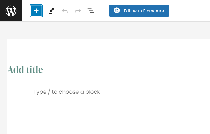
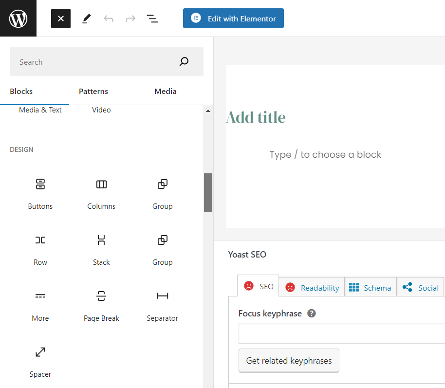
- Under the layout elements, choose the button block as shown in the following image:
- The button will be added to your post as follows:
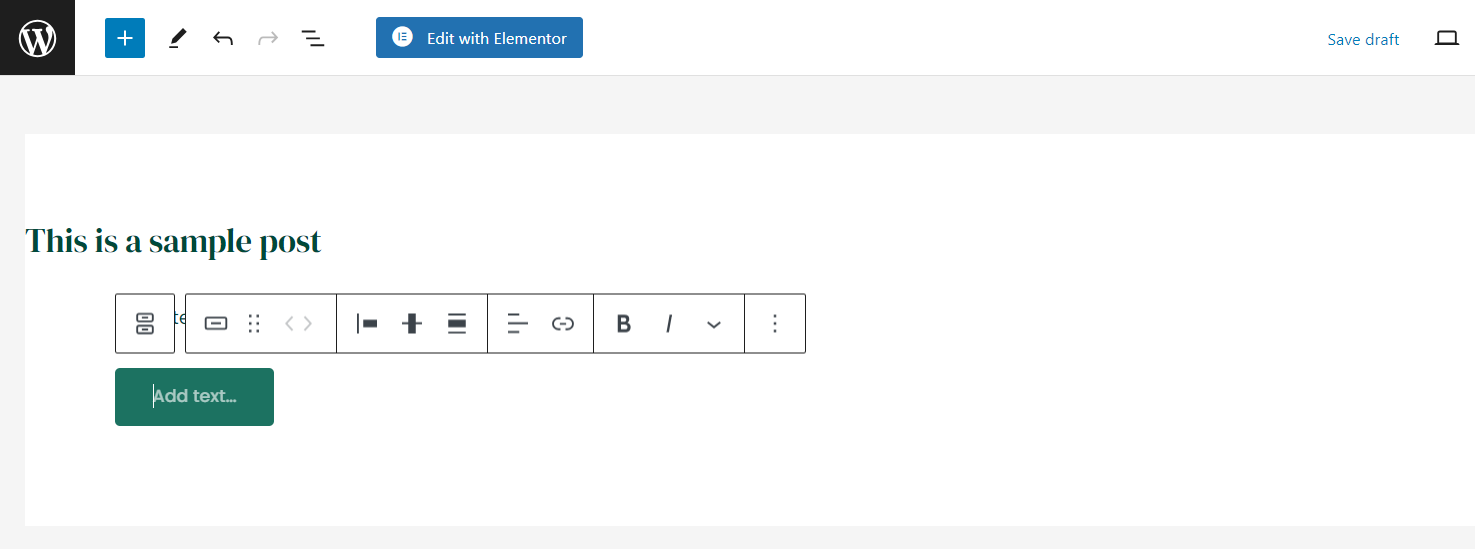
- Edit the text to ‘read more’
- Paste the link you want the button to resolve to
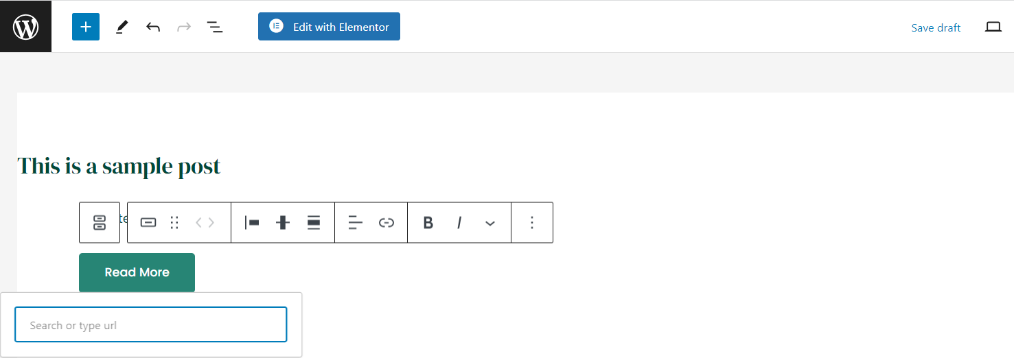
- Format the button further by choosing its alignment, color and style.
Here is how the button looks like ultimately:
.png)
If You Don't Have Gutenberg
You can still add a ‘read more’ hyperlink to serve as a button. Here is how to go about it:
- Log in to your dashboard
- Go to posts
- Then create a new post
- You can also edit an existing post
- Place your mouse cursor where you would like to display the ‘read more’ button
- Click the ‘visual’ option of your editor and choose the following icon:

- Your post will split as follows, with the words ‘MORE’ showing, and the text that will be hidden coming after it.
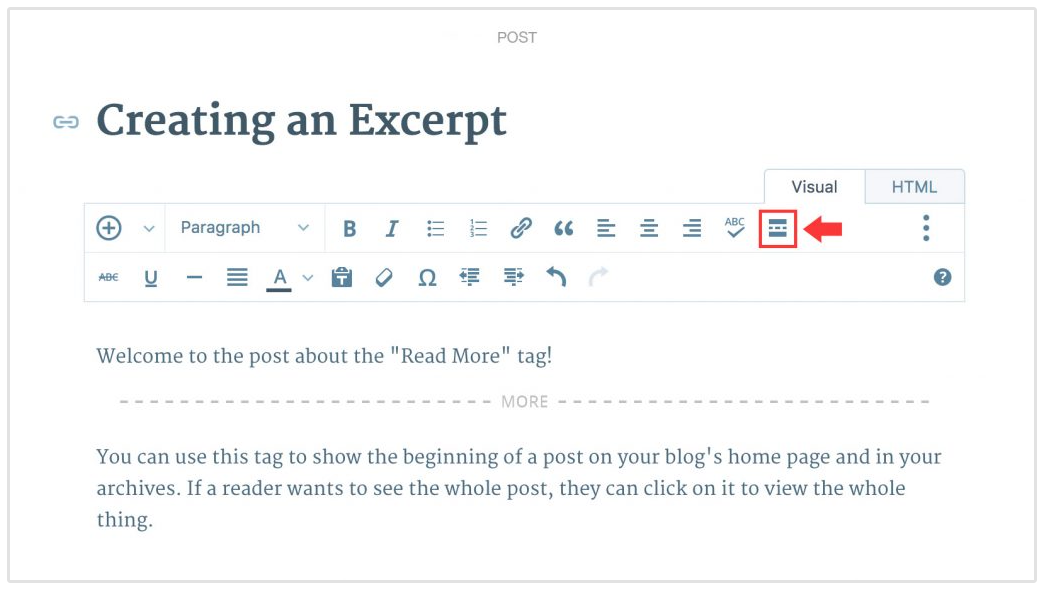
- The default text will be ‘continue reading’ but you can change that to ‘read more’
Alternatively,
- Once you have access to an existing post or have started creating a new one, you could choose the HTML option of your editor as follows:
.png)
- Place the cursor where you want the ‘read more’ to be ultimately displayed
- Choose ‘more’ from your HTML editor
- It will create a tag like this one: <!--more→
- Edit it to ‘read more’
- Make sure that this tag is placed outside other HTML tags to avoid formatting issues
Note:
- When using the read more tag on WP, you need to repeat the above procedure for each of your posts or pages.
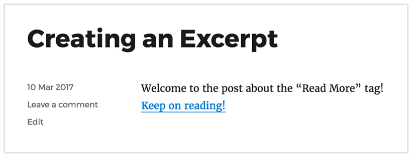
- The button is only seen on main pages like the home page or post page, and not the individual post as in:
Other Options
- Using HTML code and styling using CSS
- Using shortcodes
- Using plugins
Using Shortcodes
You can use a plugin like MaxButtons to generate short codes for your WordPress site. Here is how to go about it:
- Access your WordPress dashboard
- Go to plugins
- Search for MaxButtons and Download it
- Activate the plugin
- On the plugin’s dashboard, choose ‘Add New’
- This will take you to the button editor.
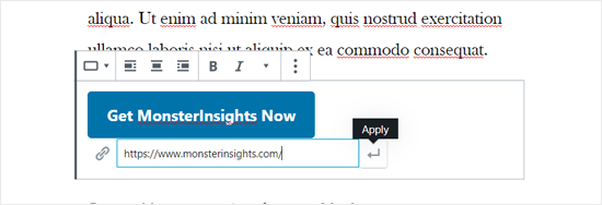
- You can then add the ‘read more’ text and the link that you want it to resolve to.
- Style the button as you want
- You can preview the changes in the ‘live preview’ button as you make them.
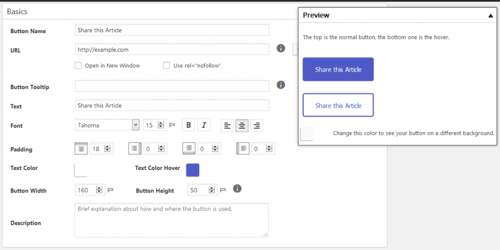
- Save the button
- Go back to the MaxButton dashboard and you will see the generated shortcode.

- Copy and paste the shortcode where you desire on your post or page
- You should be able to see the button on your post or page once it is published.
The downside to this method is that if you want to add a button that has a different style from the one you just entered you would have to edit each specific button.
Using Plugins
A plugin like Forget about shortcode buttons will come in handy, as you do not need to use shortcodes.
- Install and activate the plugin
- Create a new page or article
- On the visual editor choose insert button
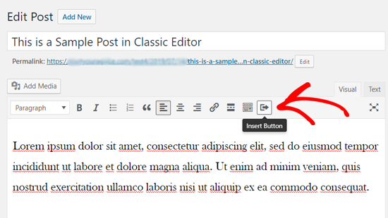
- Add the button text and the URL that you would like the button to resolve to
- Style your button as desired. Choose the icon, color, size, and alignment
- Publish your new or updated post
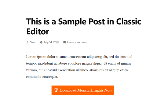
Here is how a sample button could look like:
The Impact of a ‘Read More’ Button on SEO
The ‘read more’ button is important both for users and SEO. Here are several reasons why:
Results in Easier Site Navigation
By the time your reader is getting to the ‘read more’ button, they have already read the excerpt or summarized version of your content, piquing their curiosity. This button therefore makes it easier for them to take the next step.
The user would want to know what happens next, and the ‘read more’ button ushers them into the ‘other side of the story’ where the user’s curiosity is satisfied.
Results in a Higher Rank in the SERPs
The ‘read more’ buttons can be used to encourage users to engage with more of your content, and spend more time on your site.
Also, Google is aware of how much time is spent on site due to bounce rates, so this can indirectly help your site rank higher, and could even offer a slight improvement in your rankings.
Results in a More Visually Appealing Site
Using the ‘read more’ button makes your site more appealing. Instead of having to include all the information on a single page, you only get to show what is important and direct the user towards accessing more content.
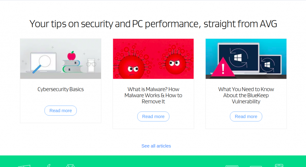
Source: AVG
Contributes to CTR
The ‘read more’ button contributes to your CTR (click-through rate). Users get a chance to interact with your content and offer and are further willing to take more action, for example, signing up or making a purchase.
The ‘read more’ acts a herald to the ‘main CTA’. If your end-goal, for example, is for people to request for a quote, then the ‘read more’ button helps guide your users to interact with more content that ultimately leads to the eventual goal.
In Conclusion
We have looked at the ‘read more’ button, its importance, and the best practices to implement it effectively on your site. Despite looking at the above best-practices, you need to continuously test to see what works for your brand and what doesn’t. You will ultimately get the right mix for you.
